Monday, 3 March 2008

Hellovon


London based Illustrator Hellovon creates amazing Drawings and Paintings. He has a vaste list of clients and has worked with Non-format.

Stanley Hooper


Stanley Hooper has been an illustrator for several years working from his studio in Brighton / England. Working for national and international publications mainly editorial and publishing work.

Michael Borremans


'MICHAËL BORREMANS star is rising steadily. The artist first made a name for himself with drawings of very detailed stage settings allowing the viewer to glimpse into surreal scenarios that evoke the reality of an artificial theater. That is the essence of Borremans’ art: tempting worlds situated somewhere very distant from our daily reality.' Luk Lambrecht

Sunday, 2 March 2008

Matt Burvill


Really nice work

Tabrez


Really nice project and the link shows the stages as the piece got passed from one designer to another.

Peter Callesen


Peter Callesen
does these amazing (!) papercuts! I really dont know how he does them though...

Celia Richards


Celia Richards does very delicate and conceptual work...

Matthew Raw


Wall
'I used the Berlin Wall and the Israeli/Palestine one as my two main research case studies to explore how walls divide people. 26 hand made bricks make up the 5m long and 3m high wall. Its size was a key factor in creating a ‘physical reality’ – designed to engender, in those who encounter it, an experience that is challenging and stimulates some of the claustrophobic feelings described by those who live in close proximity to such structures. Each brick is slab-built around a cardboard framework using especially developed crank paper-clay. Various techniques of applying text to the ceramic surface illustrate the language and findings from my research.'
Matthew Raw

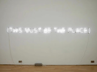
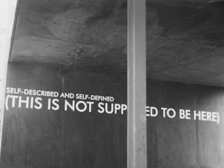
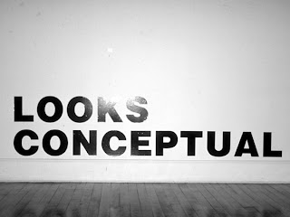
Stefan Bruggemann


The Unwritten Image
Nicolas de Oliveira

For the conceptual artist neon is a means of public writing; it displays the text for collective reading, unlike the text in a book, which is essentially for private consumption. Stefan Bruggemann’s ongoing series of ‘Text Pieces’ shows an awareness of this dynamic. Moreover, the public display and nature of these works suggest a break with linguistic understanding, an argument that is underscored by Bruggemann’s ‘Obliteration Series’.

Through the employment of a form of public address, the statement is enhanced, and its weight is all the greater. We therefore assume the statement to be of a certain significance, an utterance beyond the ordinary. Additionally, the text is given a visual shape, a form that sets it out from the wall. Therefore, the statement tends towards the condition of a picture or object. Having been prised from the serried ranks of the text, the words turn into images. Furthermore, the words are illuminated, quite literally alight or burning, making a lasting (after) image on the spectator’s retina; we are usually warned not to look directly into light-sources as this places undue stress on the eyes. What shines brightly attracts us, but it also introduces the potential for momentary loss of sight or even permanent blindness. To see then, is to become temporarily blinded. We see nothing but the afterburn of the image, something that belongs in the past. And this image eclipses the present.
Si Scott


Si Scott has also done a lot of freelance work for Non-format.

non-format


Probably the best experimental typography...

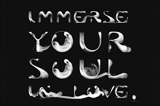
Marian Bantjes


I love Marian Bantje's work! Very nice experimental typography...

Sam Winston


Sam Winston explores narratives graphically and changes the language's meaning in a very subtle way.
There was a very nice article about him in one of the latest issues of grafik.